Welcome to Enlite Prime
Here is some guide to use this template. Click next to continue and back to previous or click on outside to skip it.
Checkboxes allow the user to select multiple options from a set. If you have multiple options appearing in a list, you can preserve space by using checkboxes instead of on/off switches. If you have a single option, avoid using a checkbox and use an on/off switch instead.
Checkbox can also be used with a label description thanks to the FormControlLabel component.
FormGroup is a helpful wrapper used to group selection controls components that provides an easier API.
descriptionsrc/app/containers/Forms/demos/Checkboxes.js
Radio buttons allow the user to select one option from a set. Use radio buttons for exclusive selection if you think that the user needs to see all available options side-by-side; otherwise, consider a dropdown, which uses less space than displaying all options.
Radio buttons should have the most commonly used option selected by default.
Radio can also be used standalone, without the wrapper.
descriptionsrc/app/containers/Forms/demos/RadioButton.js
 Buy Now

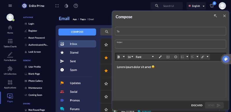
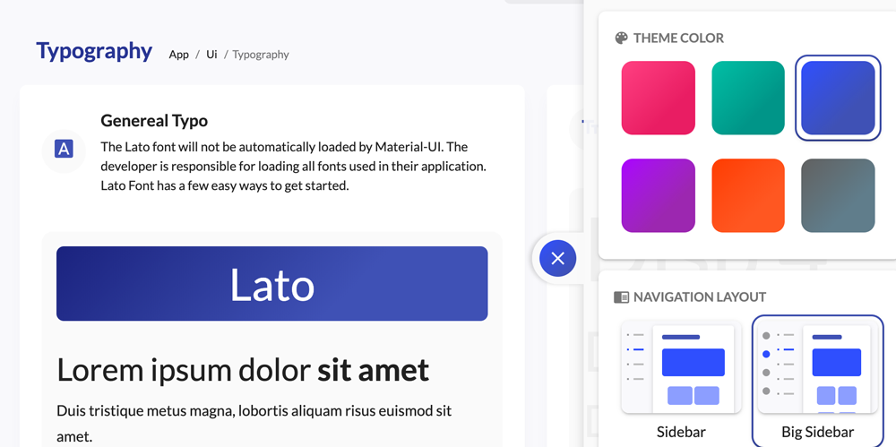
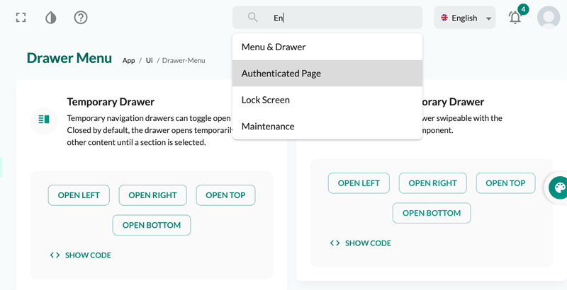
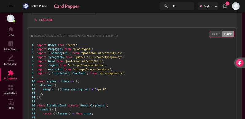
Here is some guide to use this template. Click next to continue and back to previous or click on outside to skip it.