Welcome to Enlite Prime
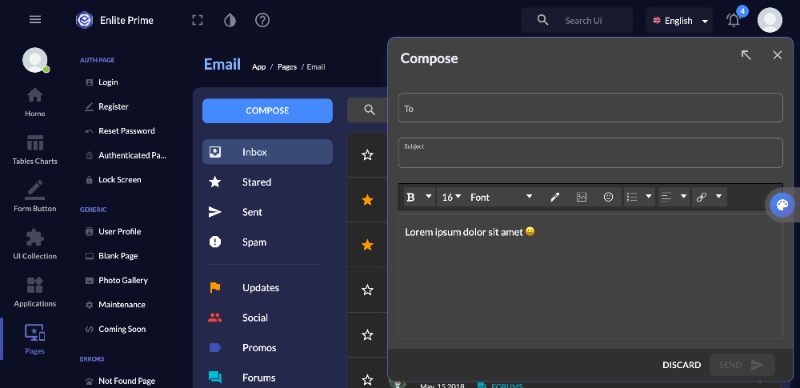
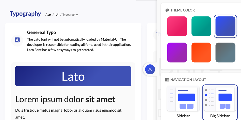
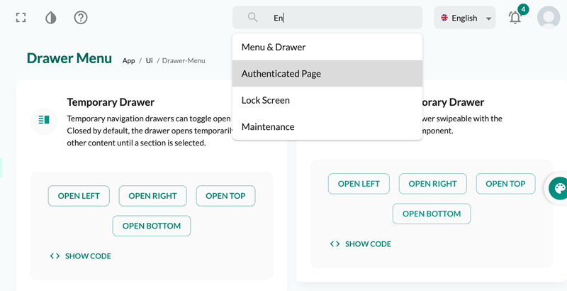
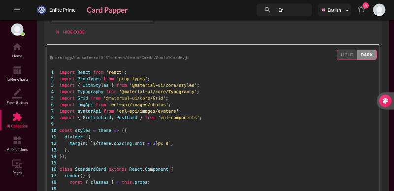
Here is some guide to use this template. Click next to continue and back to previous or click on outside to skip it.
The responsive grid focuses on consistent spacing widths, rather than column width. Material design margins and columns follow an 8dp square baseline grid. Spacing can be 8, 16, 24, or 40dp wide.
descriptionsrc/app/containers/Layouts/demos/GridLayout.js
Full-width grids: use fluid columns and breakpoints to determine when a layout needs to change.
descriptionsrc/app/containers/Layouts/demos/FullWidth.js
Centered grids: use fixed columns and re-flow the layout when all columns (plus a defined margin) no longer fit on the screen.
descriptionsrc/app/containers/Layouts/demos/Centered.js
Below is an interactive demo that lets you explore the visual results of the different settings:
descriptionsrc/app/containers/Layouts/demos/Interactive.js
 Buy Now


Here is some guide to use this template. Click next to continue and back to previous or click on outside to skip it.